Python、R言語の書き換えメモ(データの可視化編)
Python、R言語の書き換え(変換)メモのデータの可視化編です。
データの可視化は、データ分析の重要なステップの一つです。ここではPythonとR言語でよく使われるデータのグラフ化の方法をまとめました。
目次
PythonとR言語で可視化を行うためのツール
Python:matplotlib
R言語:標準のグラフツール群、もしくはggplot
データサンプル(iris)の準備
ここでは統計、機械学習などでよく使われるirisデータセットを使ってデータの視覚化を行います。
irisデータセットはR言語では標準で組み込まれています。
Pythonでは別途用意が必要となります。
seabornやscikit-learnに付属するデータセットからインポートできますが、ここではR言語のirisデータセットをcsv形式で出力してそれを読み込む方法で行います。
irisデータセット
3種類のアイリス(setosa, versicolor, virginica)が150サンプルで構成。
構成要素(カラム名)
Sepal.Length: がく片の長さ cm
Sepal.Width: がく片の幅 cm
Petal.Length: 花びらの長さ cm
Petal.Width: 花びらの幅 cm
Species: 種
R言語
> iris
    Sepal.Length Sepal.Width Petal.Length Petal.Width    Species
1            5.1         3.5          1.4         0.2     setosa
2            4.9         3.0          1.4         0.2     setosa
3            4.7         3.2          1.3         0.2     setosa
4            4.6         3.1          1.5         0.2     setosa
5            5.0         3.6          1.4         0.2     setosa
R言語からirisデータサンプルをcsv形式で書き出す
write.csv(iris, “iris.csv")
Python
Pythonからiris.csvファイルを読み込む
>>> import pandas as pd
>>> iris = pd.read_csv('iris.csv', index_col=0)
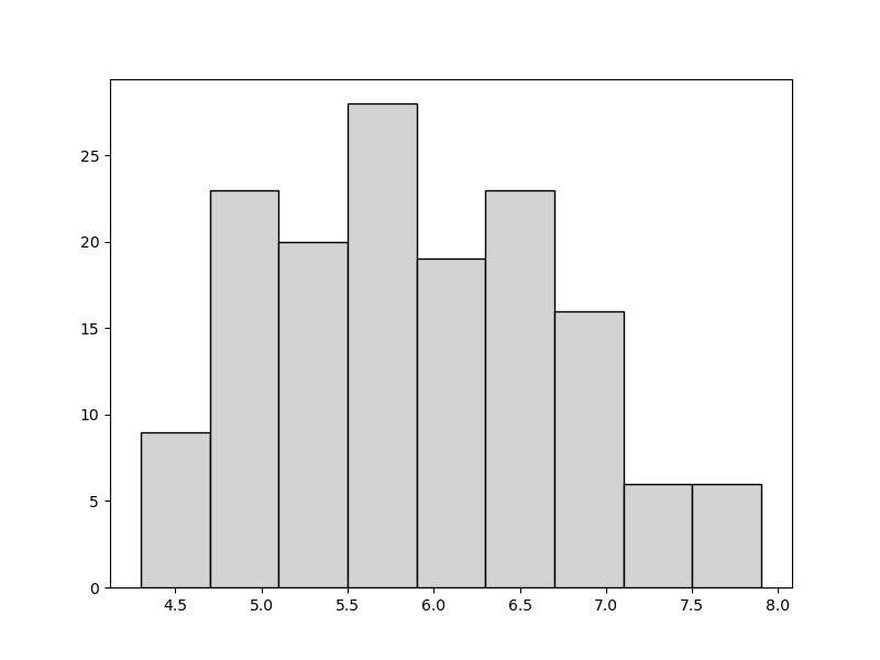
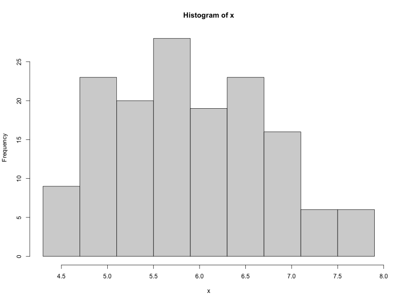
ヒストグラム
ヒストグラムの階級数を9、領域を要素の最小値、最大値で合わせた例
Python
>>> import numpy as np
>>> import matplotlib.pyplot as plt

>>> x = iris["Sepal.Length"]
>>> tmp = np.linspace(min(x),max(x),10)
>>> plt.hist(iris["Sepal.Length"],bins=tmp.round(2), color='lightgray', ec='black')
>>> plt.show()
# min~maxの要素数10の配列
# round(2) 小数点第2位まで取得
R言語
> x <- iris$Sepal.Length
> hist(x, breaks=seq(min(x),max(x),length.out=10), right=FALSE)
R言語
> library(ggplot2)
> x <- iris$Sepal.Length
> ggplot(iris, aes(x=Sepal.Length))+geom_histogram(breaks=seq(min(x),max(x),length.out=10), closed="left")

グラフをpng形式で書き出す
Python
>>> import numpy as np
>>> import matplotlib.pyplot as plt

>>> figsize_px = np.array([800, 600])
>>> dpi = 72
>>> figsize_inch = figsize_px / dpi
>>> fig, ax = plt.subplots(figsize=figsize_inch, dpi=dpi)
>>> x = iris["Sepal.Length"]
>>> tmp = np.linspace(min(x),max(x),10)
>>> ax.hist(iris["Sepal.Length"],bins=tmp.round(2),color='lightgray', ec='black')
>>> fig.savefig("hist_iris_py.png")
R言語
#標準のヒストグラムグラフを書き出す
> png("hist_iris_R.png", width=800, height=600)
> x <- iris$Sepal.Length
> hist(x, breaks=seq(min(x),max(x),length.out=10), right=FALSE)
> dev.off()

#ggplotのヒストグラムグラフを書き出す
> library(ggplot2)
> png("hist_iris_R_ggp.png", width=800, height=600)
> x <- iris$Sepal.Length
> ggplot(iris, aes(x=Sepal.Length))+geom_histogram(breaks=seq(min(x),max(x),length.out=10), closed="left")
> dev.off()
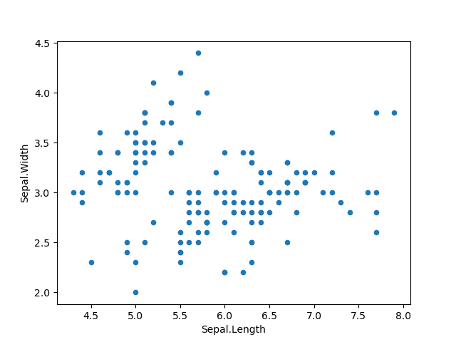
散布図
Python
>>> import matplotlib.pyplot as plt
>>> iris.plot('Sepal.Length','Sepal.Width',kind='scatter')
>>> plt.show()
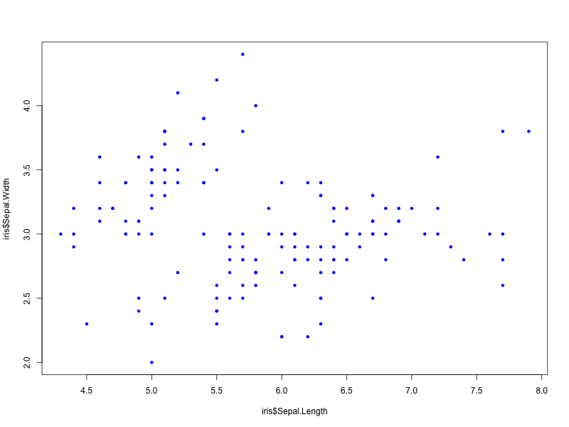
R言語
> plot(iris$Sepal.Length, iris$Sepal.Width, pch=20, col=“blue")

#pch プロットの種類
R言語 (ggplot)
> library(ggplot2)
> ggplot(iris, aes(x=Sepal.Length,y=Sepal.Width))+geom_point()

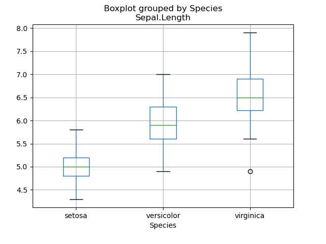
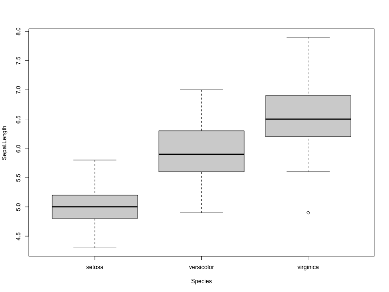
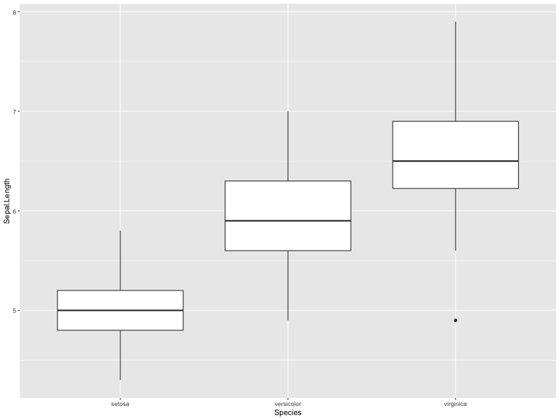
箱ひげ図
Python
>>> import matplotlib.pyplot as plt
>>> iris.boxplot(by='Species',column='Sepal.Length')
>>> plt.show()
R言語
> boxplot(formula=Sepal.Length~Species, data=iris)
R言語 (ggplot)
> ggplot(iris,aes(x=Species, y=Sepal.Length))+geom_boxplot()
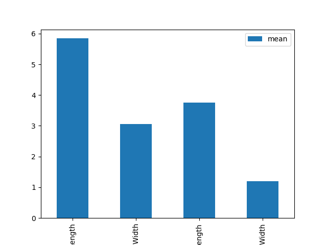
棒グラフ
Python
>>> import matplotlib.pyplot as plt
>>> pd.options.display.float_format=('{:.2f}'.format)
>>> df = (iris.describe().transpose()[['mean','std']])
>>> df.plot(y='mean', kind='bar', capsize=10)
>>> plt.show()
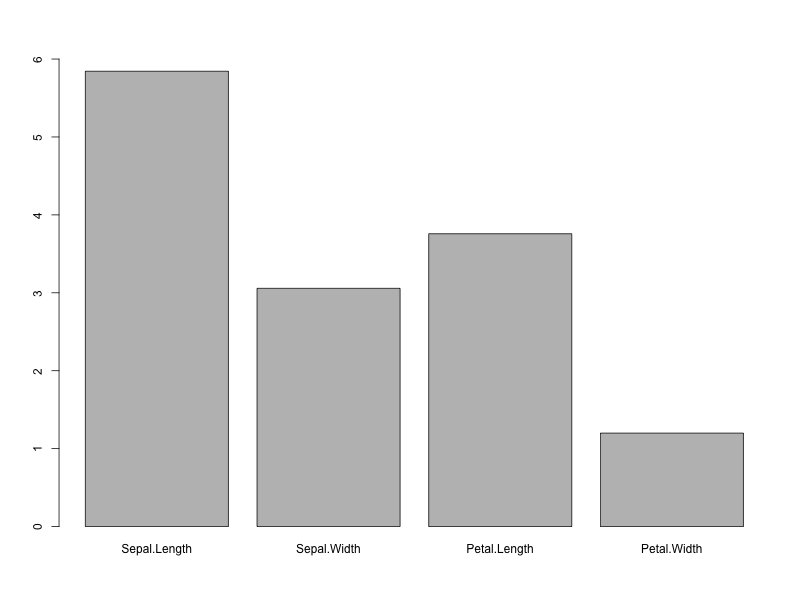
R言語
> library(tidyverse)
> df <- psych::describe(iris[,-5])
> tmp <- select(.data=df, mean)
> x <- tmp[,1] > names(x) <- rownames(tmp)
> barplot(x,ylim=c(0,round(max(x))))
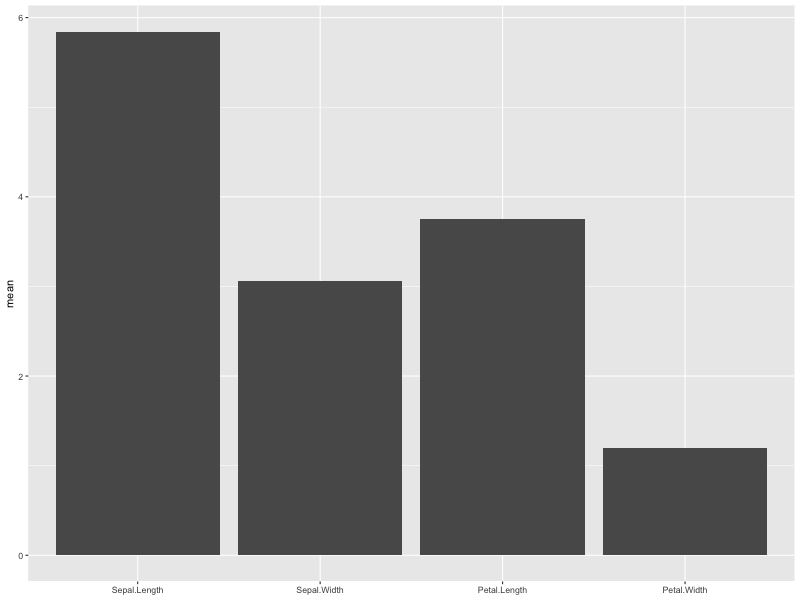
R言語 (ggplot)
> library(tidyverse)
> df <- psych::describe(iris[,-5])
> df <- select(.data=df, mean)
> tmp <- rownames(df)
> df %>% ggplot(aes(x=factor(tmp, levels=tmp),y=mean))+geom_col()+xlab(NULL)
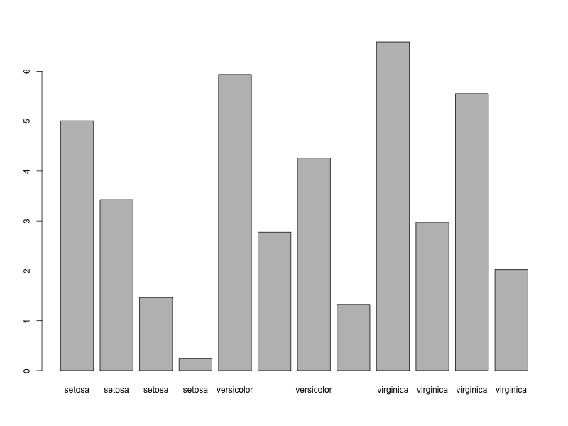
棒グラフ種類(Species)ごとの平均を棒グラフで表示
Python
>>> group=iris.groupby('Species')
>>> df=group.agg('mean')
>>> group.agg('mean').plot(kind='bar')
>>> plt.show()

R言語
> mygroup <- iris %>% group_by(Species)
> df <- mygroup %>%
summarize(across(everything(),mean)) %>%
pivot_longer(-Species)
> barplot(df$value,names=df$Species)
R言語 (ggplot)
> mygroup <- iris %>% group_by(Species)
> df <- mygroup %>%
summarize(across(everything(),mean)) %>%
pivot_longer(-Species)
> df %>% ggplot(aes(x=Species, y=value, fill=name))+
geom_col(position="dodge")

|
|
|