Memo for Rewriting Code in Python and R (Data Visualization Edition)
This is the data visualization section of the Python and R conversion memo.
Data visualization is one of the important steps in data analysis. Here, we have summarized the commonly used methods for graphing data in Python and R.
Tools for visualization in Python and R language
Python:matplotlib
R:Standard graphing tools or ggplot.
Preparing the data sample (iris)
Here, we will perform data visualization using the iris dataset, which is commonly used in statistics, machine learning, and other fields. The iris dataset is included as a standard dataset in R. In Python, you will need to prepare it separately. You can import it from datasets included in seaborn or scikit-learn, but here we will demonstrate how to export the iris dataset from R as a CSV file and then import it.
Iris dataset
Consists of 150 samples of three types of iris flowers (setosa, versicolor, virginica).
Components (column names).
Sepal.Length
Sepal.Width
Petal.Length
Petal.Width
Species
R
> iris
    Sepal.Length Sepal.Width Petal.Length Petal.Width    Species
1            5.1         3.5          1.4         0.2     setosa
2            4.9         3.0          1.4         0.2     setosa
3            4.7         3.2          1.3         0.2     setosa
4            4.6         3.1          1.5         0.2     setosa
5            5.0         3.6          1.4         0.2     setosa
Exporting iris data sample from R language as a CSV file.
write.csv(iris, “iris.csv")
Python
Reading the iris.csv file from Python.
>>> import pandas as pd
>>> iris = pd.read_csv('iris.csv', index_col=0)
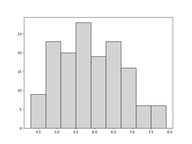
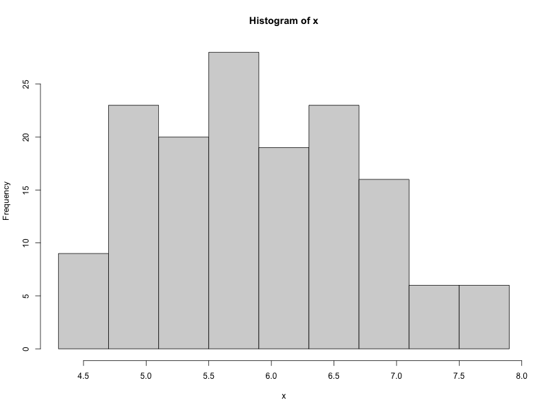
Histogram
Example of a histogram with 9 bins and range matching the minimum and maximum values of the elements.
Python
>>> import numpy as np
>>> import matplotlib.pyplot as plt

>>> x = iris["Sepal.Length"]
>>> tmp = np.linspace(min(x),max(x),10)
>>> plt.hist(iris["Sepal.Length"],bins=tmp.round(2), color='lightgray', ec='black')
>>> plt.show()
# Array of 10 elements from min to max
# round(2) to get up to 2 decimal places.
R
> x <- iris$Sepal.Length
> hist(x, breaks=seq(min(x),max(x),length.out=10), right=FALSE)
R
> library(ggplot2)
> x <- iris$Sepal.Length
> ggplot(iris, aes(x=Sepal.Length))+geom_histogram(breaks=seq(min(x),max(x),length.out=10), closed="left")

Exporting the graph in PNG format
Python
>>> import numpy as np
>>> import matplotlib.pyplot as plt

>>> figsize_px = np.array([800, 600])
>>> dpi = 72
>>> figsize_inch = figsize_px / dpi
>>> fig, ax = plt.subplots(figsize=figsize_inch, dpi=dpi)
>>> x = iris["Sepal.Length"]
>>> tmp = np.linspace(min(x),max(x),10)
>>> ax.hist(iris["Sepal.Length"],bins=tmp.round(2),color='lightgray', ec='black')
>>> fig.savefig("hist_iris_py.png")
R
# Exporting a standard histogram graph.
> png("hist_iris_R.png", width=800, height=600)
> x <- iris$Sepal.Length
> hist(x, breaks=seq(min(x),max(x),length.out=10), right=FALSE)
> dev.off()

# Exporting a histogram graph using ggplot.
> library(ggplot2)
> png("hist_iris_R_ggp.png", width=800, height=600)
> x <- iris$Sepal.Length
> ggplot(iris, aes(x=Sepal.Length))+geom_histogram(breaks=seq(min(x),max(x),length.out=10), closed="left")
> dev.off()
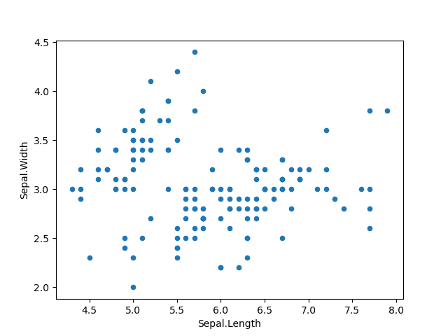
Scatter plot
Python
>>> import matplotlib.pyplot as plt
>>> iris.plot('Sepal.Length','Sepal.Width',kind='scatter')
>>> plt.show()
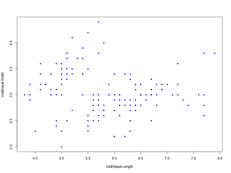
R
> plot(iris$Sepal.Length, iris$Sepal.Width, pch=20, col=“blue")

# pch: type of plot.
R(ggplot)
> library(ggplot2)
> ggplot(iris, aes(x=Sepal.Length,y=Sepal.Width))+geom_point()

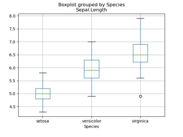
Box plot
Python
>>> import matplotlib.pyplot as plt
>>> iris.boxplot(by='Species',column='Sepal.Length')
>>> plt.show()
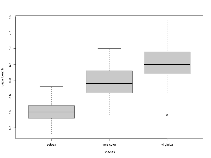
R
> boxplot(formula=Sepal.Length~Species, data=iris)
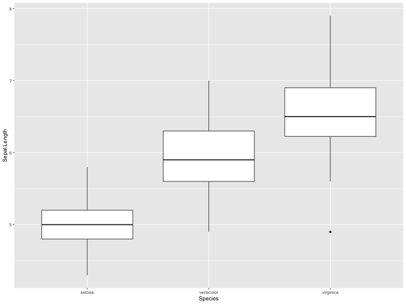
R(ggplot)
> ggplot(iris,aes(x=Species, y=Sepal.Length))+geom_boxplot()
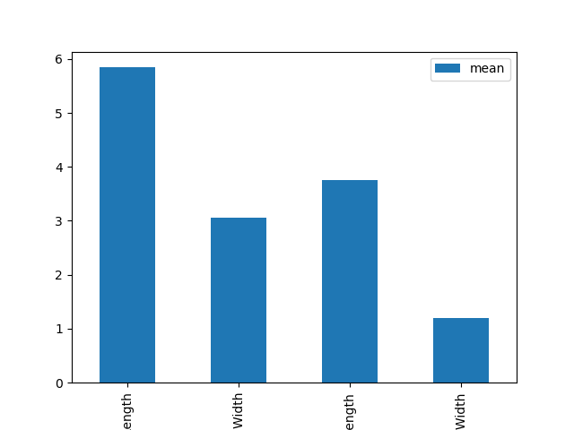
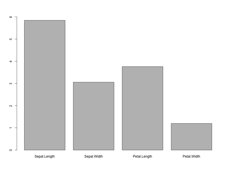
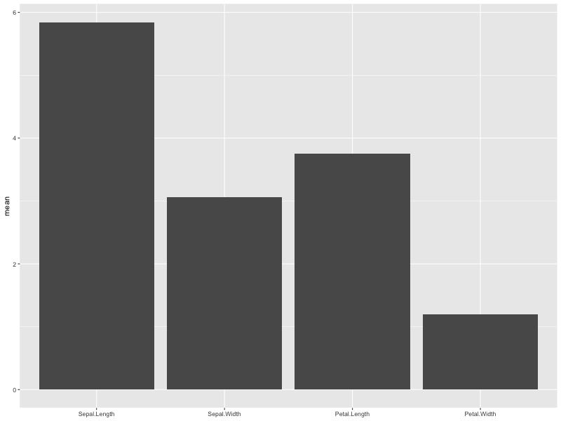
Bar graph
Python
>>> import matplotlib.pyplot as plt
>>> pd.options.display.float_format=('{:.2f}'.format)
>>> df = (iris.describe().transpose()[['mean','std']])
>>> df.plot(y='mean', kind='bar', capsize=10)
>>> plt.show()
R
> library(tidyverse)
> df <- psych::describe(iris[,-5])
> tmp <- select(.data=df, mean)
> x <- tmp[,1] > names(x) <- rownames(tmp)
> barplot(x,ylim=c(0,round(max(x))))
R(ggplot)
> library(tidyverse)
> df <- psych::describe(iris[,-5])
> df <- select(.data=df, mean)
> tmp <- rownames(df)
> df %>% ggplot(aes(x=factor(tmp, levels=tmp),y=mean))+geom_col()+xlab(NULL)
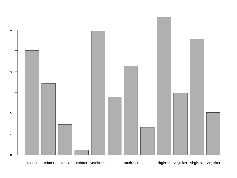
Displaying the average for each species in a bar graph
Python
>>> group=iris.groupby('Species')
>>> df=group.agg('mean')
>>> group.agg('mean').plot(kind='bar')
>>> plt.show()

R
> mygroup <- iris %>% group_by(Species)
> df <- mygroup %>%
summarize(across(everything(),mean)) %>%
pivot_longer(-Species)
> barplot(df$value,names=df$Species)
R (ggplot)
> mygroup <- iris %>% group_by(Species)
> df <- mygroup %>%
summarize(across(everything(),mean)) %>%
pivot_longer(-Species)
> df %>% ggplot(aes(x=Species, y=value, fill=name))+
geom_col(position="dodge")
